Navigation
Quick Start
Section titled “Quick Start”If you wish to just go straight to some data, select an organization from the Organization list, then choose Explore Data from the menu on the left.
Dendra works best when logged in. However, you are not required to create a login for many of the datasets.
- If you see
Log in / Sign upin the top right corner, that indicates you are not currently logged in. It will show a small human icon when you are logged in. - Dendra has a self-service single sign on system. If you wish to create an account, please follow the prompts and provide a functional email address.
Navigation
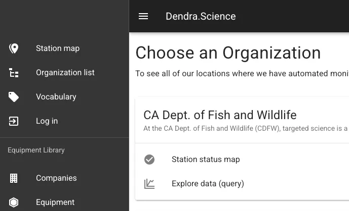
Section titled “Navigation”Dendra is designed around the organizations which use it. Navigating the website is easier once you understand that most of its features are found after you pick an organization to explore.
The menu is on the left in dark grey and may auto-collapse as you resize the browser window. Click the three horizontal bars next to Dendra.Science to re-open.
- Station Map
- Organization List
- Vocabulary
- Equipment Library
Station Map
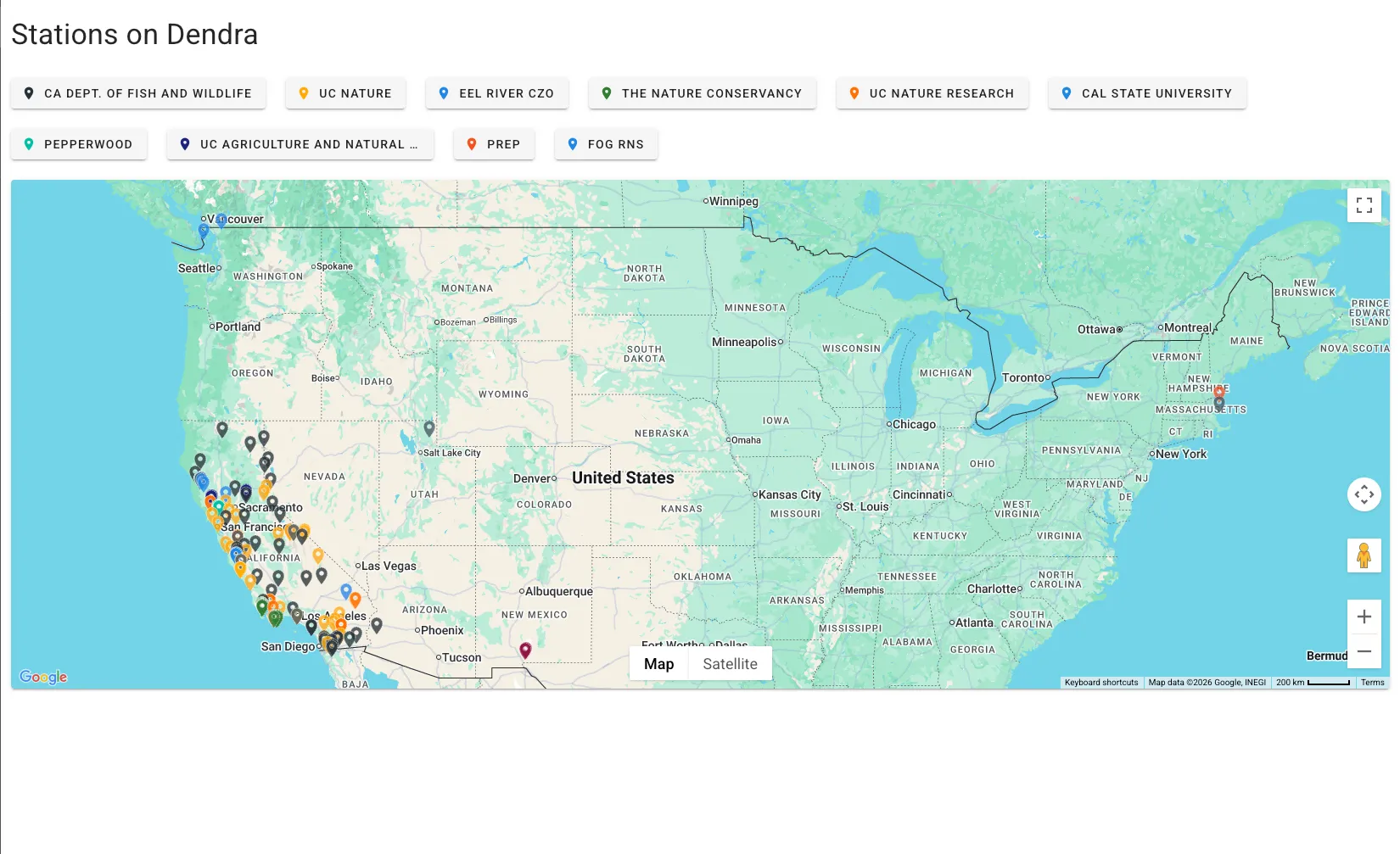
Section titled “Station Map”To see see all monitoring stations in Dendra, visit the Station Map in the menu, where stations are color coded by organization. Clicking on an organization name will bring you to that organization.
Organization List
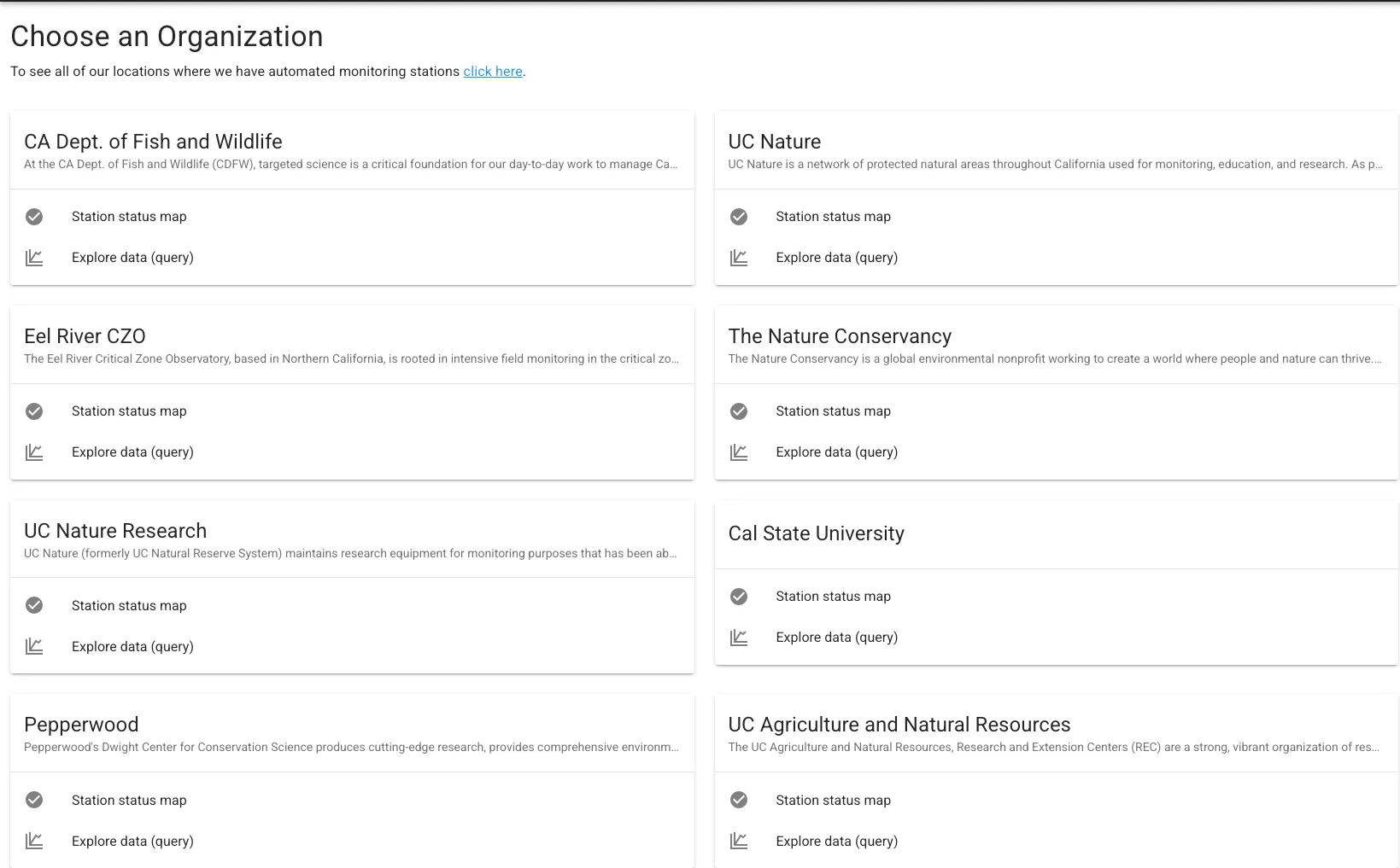
Section titled “Organization List”This page allows to you see the organizations which manage their stations on Dendra. It allows you to pick an organization, either by selecting the name and going to their landing page or going directly to a particular page, such as Explore Data (dquery) Once you choose an organization, the menu on the left changes listing some new options.
Vocabulary
Section titled “Vocabulary”See Features – Controlled Vocabulary
Equipment Library
Section titled “Equipment Library”See Features – Equipment Library
Organization Options
Section titled “Organization Options”Once you have selected an organization, the left menu will have more options. These are specific to the organization you are now within.
OverviewStation StatusExplore DataStationsDatastreamsAnnotations
Overview
Section titled “Overview”Gives a quick description of the organization and a map of its monitoring stations. It also gives clickable links listing Stations, Datastreams, and Annotations.
Station Status
Section titled “Station Status”Station Status is designed to be the home page for field technicians within the organization. It lists all stations, provides a map with the current communication status of the station. The two most common issues in monitoring are communications and power problems.
Status options:
| Symbol | Status |
|---|---|
| Online and operational. | |
| Disconnected. A station can be fully operational, but not have communications. Indicates to the viewer to not expect current data. | |
| Offline. Each organization has a configurable time-limit before an alert is sent out, usually 24 hours. If a station does not transmit data within that limit, it will register as offline. |
Status has a default compact format, but can also be set to expanded format, which gives a thumbnail image of the station. These are the icons at the top of the list.
Each station has a sparc line graph. That graph is battery voltage for 24 hours.
This gives the field technician a quick visual on the health of the battery and provides a clue as to whether there is immediate concern that the station is dead due to power loss or the more common communications failure. Power loss, obviously, is a much more urgent issue.
Dashboards
Section titled “Dashboards”From Station Status, you can click on a station, and it will bring you to a prebuilt dashboard. The dashboard gives basic metadata, such as location and photos.
More metadata is linked as Station Details. The dashboard will list the most recent common meteorological values and timestamp last seen. A non-weather station logger will not list any values here.
The dashboard includes NOAA weather forecast for the week, rainfall totals, and several two week pre-built graphs.
The dashboard is designed for people visiting the site and is not intended to replace the Explore Data page.